Are you a creative at heart who falls just a little bit short when it comes to the technical side of the low-content book publishing process?
If so, today’s post is all about YOU.
So, sit back, grab a coffee so that you don’t fall asleep, and read on to learn about the anatomy of a paperback book, and all of the accompanying printing terms that you should get familiar with.
Quick note: I’ve only included the terms that you need to be familiar with when publishing with KDP, so don’t expect to see an exhaustive list of print production terms. I don’t want to put you into a coma, just teach you the basics.
Anatomy of a Paperback Book
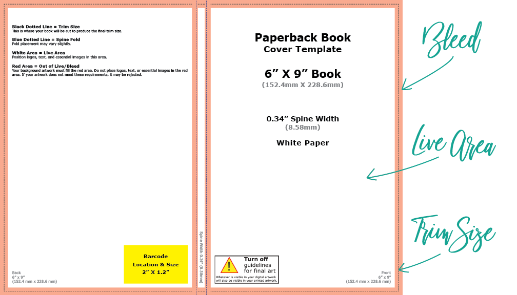
Bleed
The outer edge of a document that will be trimmed off before printing. A bleed is necessary for documents that have text or images that extend to the edge of the page. This is because, since most books are printed on large sheets of paper and then trimmed down, and because there is always a small amount of shift to account for in the trimming process, the text and/or imagery that extended to the edge of the page would invariably get awkwardly cut off without the bleed. When the document is trimmed, no unprinted area shows. Always be sure to include a bleed of 0.125” when creating your book cover or an interior manuscript that has text or imagery that extends to the edge of the page. Interior manuscripts that don’t have imagery that extends to the edge of the page do not need a bleed.
Trim Size
The final size of your printed document, after the bleed has been trimmed.
Live Area
Also known as the safe zone. Anything outside of the live area may inadvertently get cut off when trimming the bleed, so it’s important to keep all of your important text and images within this zone.
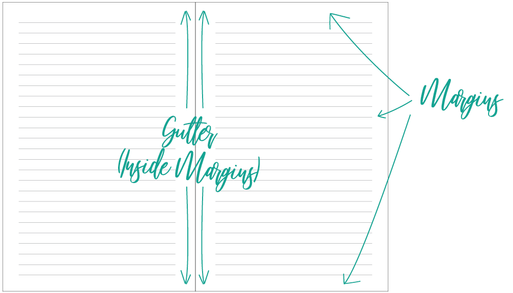
Margins
The area around the edges of the document that do not contain text. Check out Amazon’s minimum margin requirements here.
Gutter
The inside margins, closest to the spine of a book. When printing perfect-bound books, such the paperbacks printed through KDP, the inside margins have a wider minimum requirement than the outside margins because some of this area is lost in the binding process. Again, check out Amazon’s minimum margin requirements here.
All About Images
Colour Models
Before jumping straight into the two specific colour models that you should be familiar with, a quick explanation of what the heck a colour model is to begin with.
There are two main types of colour models: additive and subtractive. An additive colour model is one that uses light to display colour (such as in TVs and computer monitors), adding colours together to create a broad array of different colors. Subtractive models are used in printing, and subtract brightness from a white background by applying colour over top of it.

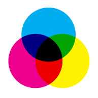
CMYK Color Model DesignerInsights.com 
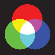
RGB Color Model DesignerInsights.com
CMYK
As mentioned, CMYK is a subtractive colour model that is used in the printing process by combining cyan, magenta, yellow, and black in various percentages, over a white background, to produce a broad array of colours. (Nerd tip, just in case you’re wondering why the letter “K” is used to represent “black” in CMYK: it stands for “key”, which represents the black key plate, which the cyan, magenta, and yellow key plates must be aligned with during the printing process.)
RGB
While CMYK is a subtractive colour model, RGB is an additive colour model, in which the colors red, green, and blue are added together in various percentages to produce many millions of different colors. As mentioned, the RGB color model is used primarily for reproduction of colours on screens, such as TVs and computer monitors, and is not meant to be used in the printing process. If you use an RGB image on the cover of your book, KDP will convert the image to the CMYK color model before printing, which means that the color that you see on your screen will not be the exact color that ends up being printed on the other side. Close matches are possible, but keep this in mind.
If all this talk about colour models is really blowing your skirt up, you can find more information here.
Resolution
Resolution is a way of describing the level of detail in an image, and is usually described in either PPI (pixels per inch) or DPI (dots per inch). The higher an image’s resolution, the higher the quality of the image.
It’s important to know that screens (such as TVs and computer monitors) only require a resolution of 72 PPI to display at full quality, while the printing process requires images to have a resolution of at least 300 DPI. This means that when choosing images for your book, always ensure that your image is at least 300 DPI at the size you want to use it. If you download an image that is only an inch wide at 300 DPI, when you scale that image up to fill the whole page you will lose resolution, and your image will look pixelated after printing. Make sure the program you are using to create your books allows you to check your image’s resolution at the scaled size.
Pay special attention to any free public domain imagery that you download, as it may be optimized for web viewing and only have a resolution of 72 PPI. Images at this resolution will reproduce at very low quality when printed, and there is no way to adequately increase the resolution.
Image resolution is only applicable to raster images, which we’ll get to in just a sec.
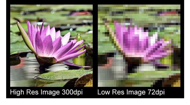
Image Types
It’s vitally important to understand the two main types of images that are available for you to use when created a printed book, so that your images always printed crisply and clearly. The two terms to get familiar with are…
Raster Image
Raster images are made of up of a set number of pixels, and can only be scaled up to a certain point before losing their resolution. We’ve all seen blurry, pixelated images before, when someone has tried to enlarge an image that doesn’t have the necessary resolution. For print, raster images must remain at at least 300dpi. Anything lower than that, and the images loses quality and begins to appear pixelated and out of focus. If you place a raster image into your book that is too small, and you need to scale the image up in size, always check the resolution of that image at the scaled-up size before sending it to print so that you don’t end up with a blurry image. If your image resolution is too low, KDP will catch it in the publishing process, but it’s best to ensure your images are the correct resolution before getting that far down the line, and then having to go back to the drawing board right as you’re ready to print.
How you do know if you have a raster image? Raster images usually come in .JPG, .GIF, .TIF., .BMP, or .PNG format, and are most commonly employed in photographs. If your image is an illustration or some other type of graphic, it is most like a vector image.
Vector Image
Vector images, meanwhile, are not made up of pixels. They are made up of lines created through mathematical equations, and are scalable to any size, making them ideal for any printing situation. So, if you use a vector graphic in your book, feel free to scale as large as you want without having to check the resolution before going to print. These types of files usually end in .SVG, .EPS, or .PDF, and are most commonly used in illustrations and other graphics.
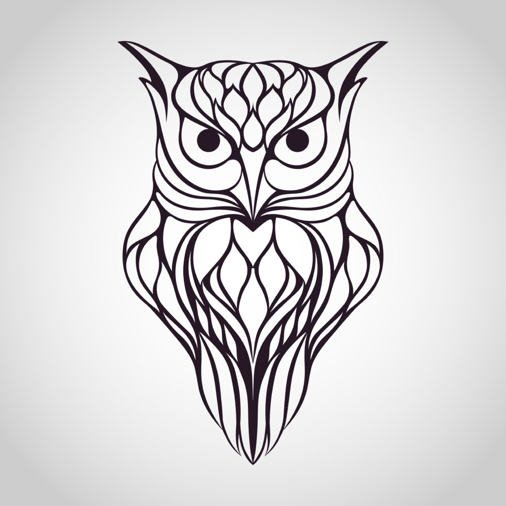
Quick note, because I’ve seen this done soooo many times in my career as an Art Director: you cannot save a raster image with a vector graphic file extension and then, poof, you now have a scalable vector graphic. Your image is still a raster image and will still look like crap at scale.
Congratulations, you are no longer print production-challenged! You now have all of the lingo down and have a solid understanding of exactly what the heck you are doing when considering the technical aspects of creating your low-content books.
For more information on KDP’s specific requirements for printing paperback books, check out this guide.
If I’ve missed something here, or if you have further questions regarding the printing process, leave them in the comments below.
FREE GUIDE: 3 Steps to Publishing Your First Low-Content Book in Less Than a Day
MORE LOW-CONTENT PUBLISHING TIPS: https://www.rachelharrisonsund.com/
Wow!! What a wealth of info! Thank you, thank you Rachel for sharing your experience and knowledge…….I so appreciate this as a beginner AND a non-technical type of gal 😉
Glad you found it useful, Susan!
Thanks for sharing all of this info, Rachel. As always, you’re a wealth of knowledge!
Two questions…
1) Is there a way (I’m on a MacBook Pro) change/increase a raster image’s resolution? Often times I get images from Pixabay that are lower resolution, and they don’t scale well.
2) When creating our books on KDP, for the cover, should we use matte or glossy finish?
Thanks!
Hi Ray, there’s not really a clean way to increase an image’s resolution, since to do so, you’d have to add the detail that missing in the first place. But, if you have Photoshop, or another photo editing software, you can check out these tips, which might be helpful: https://photographylife.com/how-to-increase-the-resolution-of-an-image
Matte or glossy is a personal preference, but matte finishes tend to look more professional and less “tacky”. That being said, you may want to choose a glossy finish for a cover that has “sparkly” artwork.
As always, you’ve provided so much helpful information! All of your videos (etc.) have really helped me gain the confidence to start creating LC books. I have two “live” and many, many more ideas. So thank you! You’re awesome!
That’s awesome, Jules! Thanks for reading!